Where The Hell Is Everyone?
Humanity as 100 dots on a map but for real

Answer: In the Ganges river basin.

This is a map that visualizes the world population as 100 dots. Each red dot represents 80 million people.
I created this map because I find it difficult to interpret typical population density maps, like this one:
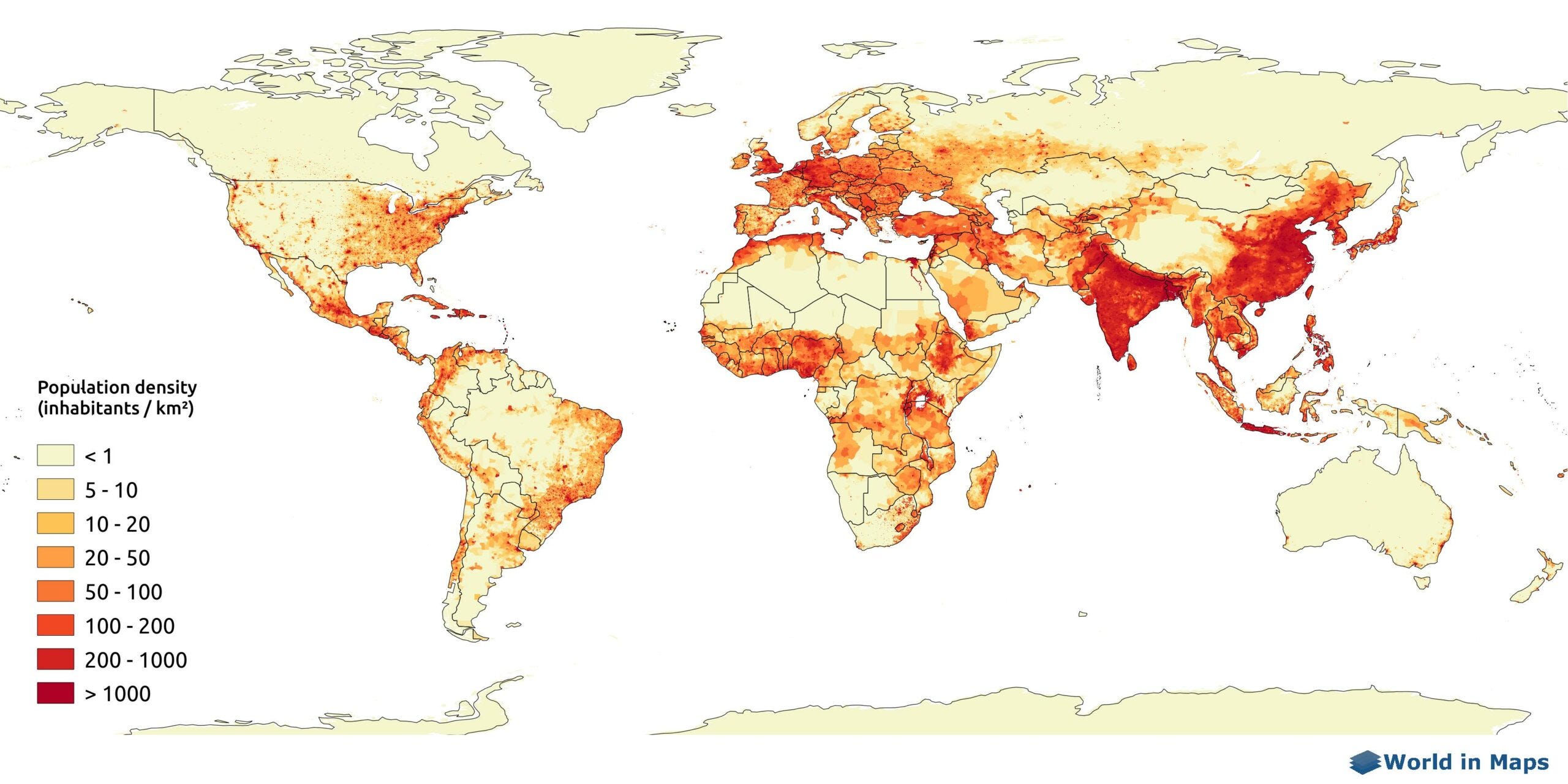
Looking at this map, I can tell there’s a lot of people in Indian and Eastern China, but I can’t really tell just how many more there are compared to everywhere else. My brain can’t translate the shade of red into a quantity. In fact, the color key isn’t even set up to convey this well: each step of shading is a logarithmic increase, not a linear one.
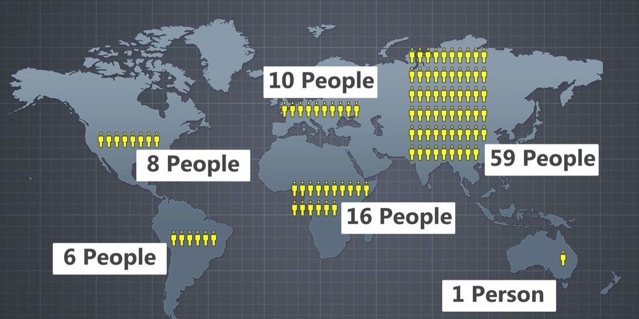
Conversely, I was sick of extremely imprecise visualizations like this one:
I wondered, “is there some rigorous way of approximating a distribution well with a small number of discrete points?” and I googled it and it turns out, yes, there is. It’s called Support Points.
Remarks on my map:
Holy shit northern India is crowded. There’s there and then everywhere else.
India and China are like, the whole deal.
Eastern Africa is more populated than I realized.
America has a lot of room for more people!
Scandinavia and western China are really empty.
Problems:
In a few cases dots in sparsely populated areas are placed wonkily. Like the dot floating in the Caribbean and the one in northern Australia. This is because they’re caught between different populated areas.
The distance function used to decide on the points is just the Euclidian distance across the cylindrical projection, which distorts it somewhat especially around the edges.
I implemented the Support Points method using gradient descent instead of convex optimization which makes it somewhat less accurate.
There are various things I could do to make this map more polished but my curiosity has been satiated and no one’s paying me to do this so I’m probably not going to. Enjoy!
No dots in Greenland. Sad!